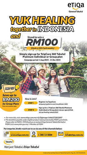
EDM Design
Campaign Poster
In designing the EDMs for Etiqa's campaigns, I focused on maintaining brand consistency while ensuring each visual communicates the core message clearly and effectively. Across all campaigns, the goal was to create a balance between a clean, modern design and functional messaging that speaks directly to the audience.
In each design, I employed the principle of visual hierarchy to control the order in which the audience processes information. The headline, typically the most significant element (e.g., bold "Stand to win RM100"), immediately draws attention and communicates the primary incentive. Supporting information, such as campaign instructions or terms, is then presented in a less dominant but still accessible format. This hierarchy ensures that users can quickly grasp the essential message while still being able to find detailed information easily.
"Yuk Healing Together in Indonesia" Campaign (Etiqa General Takaful)
Bold Typography: "YUK HEALING together in INDONESIA" uses a strong, engaging font to draw attention. The bright orange color resonates with excitement and energy.
While the designs work well overall, a bit more white space could improve the clarity and modern feel. This would help avoid visual overcrowding and enhance readability. Additionally, experimenting with more varied text sizes between headings, subheadings, and body text could further emphasize important details.


Client : Etiqa